Wednesday, January 25, 2023

Creating the Illustration for the SCBWI Michigan 2023 Conference - Part 3: Feedback and final comp


I received positive feedback from the SCBWI Michigan conference team on the three concept sketches.  They liked the cave scene and asked if the dragon could be included.  They even gave the OK for a 980 x 500 px banner to give me more room for the dragon.  Yay!

The first thing I did was to mock up the composition in ArtRage.  I didn’t realize how much bigger 1080 pixels would be than 200 or 500 pixels!


My initial attempt was to just make the stalagmites really tall and the elevator would stay in the same position for all three formats with the dragon showing up in the two larger ones, which you can see in the dull red and dull green shapes.

I drew some items with digital ink and others with digital pencil.  I thought the pen drawn elements would be stronger in the foreground and the pencil ones would fade into the background.  It didn’t seem to work as well as I thought.

I also played with the layer blend modes to create the headlamp spotlight effect.  I just made a yellow-orange triangle shape on a separate layer and found the screen blend mode worked pretty well when reducing the opacity a little bit, too.

I felt the stalagmites looked too tall and the elevator looked cramped at the top in the square format.  Since I had drawn many of the elements on different layers, it was easy to rearrange them into this composition, which was closer to my PowerPoint rough comp.


Throughout this illustration process, I used a combination of digital and traditional tools.  Periodically, I reviewed print outs to look more critically at the piece, which is what I did here.  Scale up the miners.  Make sure there is value contrast with the spotlight and background.  New ideas came.  The spear shape at the end of the dragon’s tail would become a pen nib.  Hidden jewels might be in CMY (Cyan, Magenta, Yellow) colors.


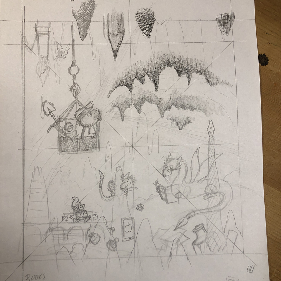
Based on the printout I scaled up my drawing on 11x17 tabloid copy paper.  I started with the primary elements: the gopher and mole in the elevator, the dragon, the timid goblin, and the pen, pencil, and paintbrush in the stalactites and stalagmites.  Then my mind wandered around the rest of the cavern, imagining what else might be hidden there: a stack of books, glass inkwells, an iPad, a dwarf on a bridge.


Here are some other sketches.


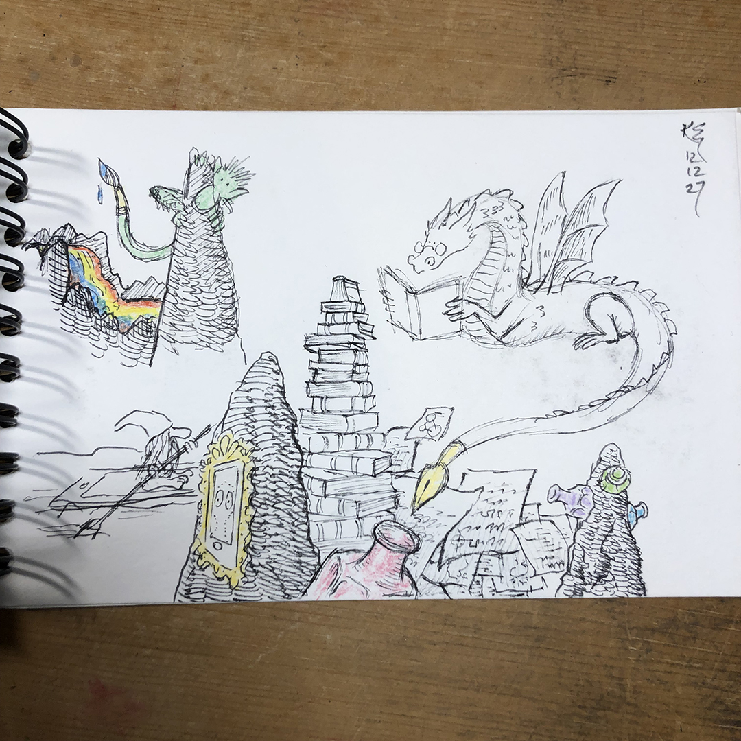
Another version was drawn on tabloid paper, shifting things a bit and polishing up some of the ideas.

I had also done some research with Google, looking up mine elevator, which drove the change from a chain and gear mechanism to a simple hook and cable. 


I tried out a few different pencils and techniques to draw the stone textures and the characters.  I used the flat of the pencil tip and danced it around a bit for the most part.  Then scanned them into Photoshop with my Plustek Optic Pro A320L scanner and was happy with the combination of traditional pencil and digital color.


While driving to work after the holiday break, I thought I should try to include something about Michigan to represent our SCBWI chapter.  Brianne Farley did a great job of this with the SCBWI Michigan website banner, which included a state bird – a robin, state flower – an apple blossom, sand dunes, and a lake.  My idea?  Incorporate the shape of Michigan’s upper and lower peninsula into the depths of the cave. 


As soon as I got to my desk, I sketched it up.  I imagined the thin strip of water between the upper and lower peninsula as the narrow bridge in the Mines of Moria, where Gandalf defended it against the fiery Balrog.  The state outlines would be in the negative space of the cavern’s darkness.

Once back at the computer, I played around with the scale and placement of a Michigan map on my scanned in pencil drawing and created the layered look I was after.


Once I confirmed that the conference team was onboard with the concept, it was time to make the “finished” pencil drawings.

Wednesday, January 18, 2023

Creating the Illustration for the SCBWI Michigan 2023 Conference - Part 2: Initial comps


After brainstorming ideas for the illustration for the SCBWI Michigan 2023 conference, “Digging Deeper: Unearthing Your Literary Treasures”, I needed compositions that would work in two size formats: 1080 x 1080 px and 980 x 200 px.

I focused on the long, narrow format first.  My logic was if I could make a good illustration in the smaller format, I could always add more elements in the larger square.

I wanted to have three concepts to submit and roughly worked out these four.  In the second concept, I thought of a geographic cross section of the earth with its different layers and hidden resources like sedimentary rock, bedrock, ground water, oil, etc.  I quickly tossed this idea out because 1) the text would fight the text about the conference, and 2) it would be difficult to include characters (i.e. boring!).


I then used Microsoft PowerPoint to mockup the three concepts.  I use PowerPoint almost every day in my engineering job and keep learning new tricks with it.  It can be used much like Adobe Illustrator and InDesign for concepts like this and is much easier to use.  There are lots of ready to use shapes, vector icons, and clip art.  Although you can’t see the layers, each element is on one.  So, you can send elements forward or backward.  You can import images and perform basic edits to them and more.  I’ll make another post in the future about some of these tricks.  Until then you can find plenty of resources on the internet to learn how to use it.


For these I used default shapes, icons, and a few freehand shapes.  I wasn’t given the final text, so I added what I thought might be there to make sure there was a reasonable amount of space for it.  Once I had enough to get the idea across, I mocked up square versions of each one.  I wanted to feel confident that each concept could work in either format.  I imagined each piece as a mini poster, where the text is the focal point.


I printed these out, and a few new ideas popped up, such as using a pen, pencil, and paintbrush as stalactites and stalagmites in the cave.


I then drew up the concepts on paper, which is when more ideas happened.  When drawing the cave, I saw opportunities to sneak in other elements, like the bat and goblin.  Rather than directly repeat the literary treasures in each concept, I tried to come up with different ones.  When I drew the chipmunk-like character digging into the mountainside, I thought of Bilbo Baggins sneaking into the dragon’s treasure chamber.  Hence, my more bookish version of the mighty Smaug.


At this stage I was already planning to draw most of the elements separately and assembling them digitally.  This would give me more flexibility to move things around between the long rectangle and square formats, as well as making room for more text and creating standalone images.


Next, part 3: feedback and more roughs.

Tuesday, January 17, 2023

Creating the Illustration for the SCBWI Michigan 2023 Conference - Part 1: Brainstorming


In support of aspiring illustrators in SCBWI and everywhere, I wanted to share my process for this fun illustration project for the SCBWI Michigan 2023 conference.  The conference theme was “Digging Deeper: Unearthing Your Literary Treasures.”

There were two size formats:

  • 1080 x 1080 px
  • 980 x 200 px

(I was later allowed to make one at 980 x 500 px as well.)

The illustration needed to allow room for text about the conference and the SCBWI logo.

My first step was to brainstorm off the theme, which was a visually rich one.  I listed words and made quick sketches, based on the words, digging and treasures.  But I couldn’t forget the two adjectives linked to them: deeper and literary.

As you can see from the pictures, I dug into range of sources from gold mines of the American West to dwarf mines of Middle Earth, and Poldark’s copper mines of Cornwall, England.

This is usually the fun part of an editorial illustration for me.  I let words and images flow as quickly as I can get them down.  As the project progresses new ideas pop up.  So, brainstorming doesn't really stop.  If I get stuck on a subject, I will consult a thesaurus for related words, browse my personal book collection, or search the internet.  Or I might just need to a rest to let it marinate in the back of my mind, while doing other things.


In part 2 I will show how I developed this ideas into three rough layouts for my initial submission.


Illustration for the SCBWI Michigan 2023 Conference


I was honored to be asked by our SCBWI Michigan chapter’s illustration coordinator, Katie Eberts (an accomplished illustrator herself), to create an illustration for our 2023 conference.  The conference theme was “Digging Deeper: Unearthing Your Literary Treasures.”

For those interested in attending the April 1, 2023 conference in Livonia, Michigan, here is the link to the conference page.

Michigan | Digging Deeper: Unearthing Your Literary Treasures SCBWI-MI Conference

This was fun project to work on.  I will be creating blog posts on how I made illustration in support of aspiring SCBWI illustrators.


Below are the original illustrations without text and shown in all formats.


Monday, January 25, 2021

More about Mull & Cull #28 - Trust is a bridge we build together


Can you spot the differences between the two pictures?  See if you guessed correctly down below.


I didn't want to ruin the message of my previous post on trust by talking about the artwork.  So, I'll do so now. 

Back around my last post in 2015, I decided to try my hand a writing a picture book.  This endeavor has  consumed most of my free creative time, resulting in a complete neglect of my blog.  But the challenge has been worthwhile.  I joined SCBWI (Society of Children's Book Writers and Illustrators), read several good blogs and books on writing and illustrating picture books, watched many YouTube posts, and wrote several manuscripts.  I now have a two promising manuscripts and one book dummy completed.  Once the other book dummy is complete, it's time to pursue an agent!

One of my stories deals with a troll and bridges.  When I was researching trolls (yes, one can research trolls!), I came across the old story of the Three Billy-Goats Gruff.  It's a very simple story about three goats crossing a bridge.  The troll under the bridge wants to eat the goats, but he lets the first and second one pass with the promise that the next goat will be bigger and fatter for him to eat.  The last goat is indeed big, and it does not end well for the troll.  You can read the story here if you want.

After the capitol riots on January 6th, I had been jotting down notes and sketches about trust, as it is something our country is in desperate need of.  One of them was a bridge made of the letters in trust, as if they were children's alphabet blocks.  I thought it would be nice to change the original story of the goats and the troll to one where they work together on making the bridge. Now the troll has a home under the bridge, and the goats can cross over it to feed in the mountain's fields. If goats and trolls can work together, surely people can as well!  Right?

Well, one can only hope and do what they can.

Back to the art - I drew this on standard laser printer paper and inked it with Speedball Super Black India Ink, using a Windsor & Newton Cotman 111 #4  round brush.  I was very pleased with this brush.  It held its point well, and the ink flowed smoothly from it.

I scanned the line art into Photoshop to add the color and yellowed, pulp paper texture.

Many times I make minor corrections to my line art in Photoshop, and this was no exception.  There are the few stray lines to clean up and I shifted the "IS A BRIDGE" text over to the left a bit.  I also changed the big goat's eyes to be more of a squint as he lowers the block into place.  

But my biggest fix was the troll.  Did you notice his feet were visible in the original art? I lost sight of the troll's standing position relative to the bridge.  His head and arms are at slightly under the bridge, but his feet appear to be out in front of it.  It just didn't look right.

How did I spot this, you ask?  If you follow the bridge's shadow down the  hill to the water line, the troll's feet were well away from where the shadow would fall if the light is directly above him.


So, I erased the lower part of his legs and drew in more water ripples.  Now you don't know if the water is very deep or if the troll has very short legs.  Problem solved!

Most people would probably never notice these details, but I expect a good art director would.  So, I try to be a good critic of my own work.  If one is self aware, one can self improve.


Mull & Cull #28 - Trust is a bridge we build together


After recent events and what has been happening to our country over the past several years since my last post, I thought it was time to come out with something positive.

There is trust that you can build within yourself, but I am speaking to building trust between yourself and others.  It is not easy.  It takes time and patience.  If you're not careful, the bridge of trust can be broken and burned, but if the foundations are firm, it can be rebuilt.  

I hope the citizens of our country can remove themselves from their internet echo chambers that only resonate with their own viewpoints, real or misguided, and talk to someone from the other side in person, preferably on an ongoing basis.

Please consider building or rebuilding a bridge with someone today.