Can you spot the differences between the two pictures? See if you guessed correctly down below.
I didn't want to ruin the message of my previous post on trust by talking about the artwork. So, I'll do so now.
Back around my last post in 2015, I decided to try my hand a writing a picture book. This endeavor has consumed most of my free creative time, resulting in a complete neglect of my blog. But the challenge has been worthwhile. I joined SCBWI (Society of Children's Book Writers and Illustrators), read several good blogs and books on writing and illustrating picture books, watched many YouTube posts, and wrote several manuscripts. I now have a two promising manuscripts and one book dummy completed. Once the other book dummy is complete, it's time to pursue an agent!
One of my stories deals with a troll and bridges. When I was researching trolls (yes, one can research trolls!), I came across the old story of the Three Billy-Goats Gruff. It's a very simple story about three goats crossing a bridge. The troll under the bridge wants to eat the goats, but he lets the first and second one pass with the promise that the next goat will be bigger and fatter for him to eat. The last goat is indeed big, and it does not end well for the troll. You can read the story here if you want.
After the capitol riots on January 6th, I had been jotting down notes and sketches about trust, as it is something our country is in desperate need of. One of them was a bridge made of the letters in trust, as if they were children's alphabet blocks. I thought it would be nice to change the original story of the goats and the troll to one where they work together on making the bridge. Now the troll has a home under the bridge, and the goats can cross over it to feed in the mountain's fields. If goats and trolls can work together, surely people can as well! Right?
Well, one can only hope and do what they can.
Back to the art - I drew this on standard laser printer paper and inked it with Speedball Super Black India Ink, using a Windsor & Newton Cotman 111 #4 round brush. I was very pleased with this brush. It held its point well, and the ink flowed smoothly from it.
I scanned the line art into Photoshop to add the color and yellowed, pulp paper texture.
Many times I make minor corrections to my line art in Photoshop, and this was no exception. There are the few stray lines to clean up and I shifted the "IS A BRIDGE" text over to the left a bit. I also changed the big goat's eyes to be more of a squint as he lowers the block into place.
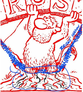
But my biggest fix was the troll. Did you notice his feet were visible in the original art? I lost sight of the troll's standing position relative to the bridge. His head and arms are at slightly under the bridge, but his feet appear to be out in front of it. It just didn't look right.
How did I spot this, you ask? If you follow the bridge's shadow down the hill to the water line, the troll's feet were well away from where the shadow would fall if the light is directly above him.
Most people would probably never notice these details, but I expect a good art director would. So, I try to be a good critic of my own work. If one is self aware, one can self improve.


