After brainstorming ideas for the illustration for the SCBWI
Michigan 2023 conference, “Digging Deeper: Unearthing Your Literary
Treasures”, I needed compositions that would work in two size formats: 1080 x
1080 px and 980 x 200 px.
I focused on the long, narrow format first. My logic was if I could make a good
illustration in the smaller format, I could always add more elements in the
larger square.
I wanted to have three concepts to submit and roughly worked
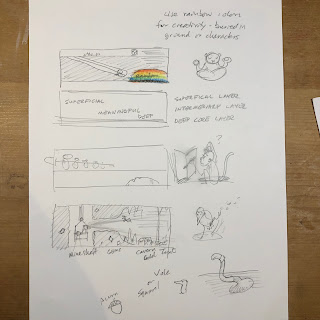
out these four. In the second concept, I
thought of a geographic cross section of the earth with its different layers
and hidden resources like sedimentary rock, bedrock, ground water, oil, etc. I quickly tossed this idea out because 1) the
text would fight the text about the conference, and 2) it would be difficult to
include characters (i.e. boring!).
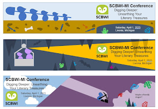
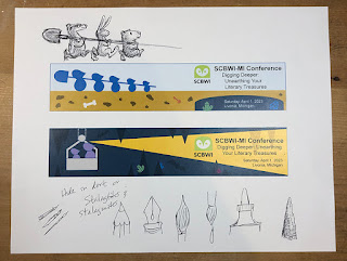
I then used Microsoft PowerPoint to mockup the three concepts. I use PowerPoint almost every day in my engineering
job and keep learning new tricks with it.
It can be used much like Adobe Illustrator and InDesign for concepts
like this and is much easier to use.
There are lots of ready to use shapes, vector icons, and clip art. Although you can’t see the layers, each
element is on one. So, you can send
elements forward or backward. You can
import images and perform basic edits to them and more. I’ll make another post in the future about
some of these tricks. Until then you can
find plenty of resources on the internet to learn how to use it.
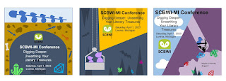
For these I used default shapes, icons, and a few freehand shapes. I wasn’t given the final text, so I added what I thought might be there to make sure there was a reasonable amount of space for it. Once I had enough to get the idea across, I mocked up square versions of each one. I wanted to feel confident that each concept could work in either format. I imagined each piece as a mini poster, where the text is the focal point.
I printed these out, and a few new ideas popped up, such as
using a pen, pencil, and paintbrush as stalactites and stalagmites in the cave.
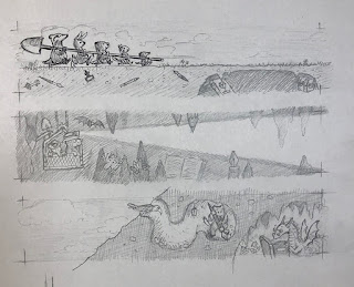
I then drew up the concepts on paper, which is when more ideas
happened. When drawing the cave, I saw opportunities
to sneak in other elements, like the bat and goblin. Rather than directly repeat the literary
treasures in each concept, I tried to come up with different ones. When I drew the chipmunk-like character
digging into the mountainside, I thought of Bilbo Baggins sneaking into the
dragon’s treasure chamber. Hence, my
more bookish version of the mighty Smaug.
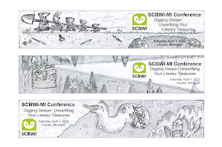
At this stage I was already planning to draw most of the
elements separately and assembling them digitally. This would give me more flexibility to move
things around between the long rectangle and square formats, as well as making
room for more text and creating standalone images.
Next, part 3: feedback and more roughs.



No comments:
Post a Comment